
Display
Display Settings control how the Projects section behaves on the front end of the site. This includes the project URL, admin label, landing page, category pages, project card layout, images, pagination, detail pages, and custom CSS.
These settings do not create or delete projects. They control how existing projects are shown, linked, filtered, and styled.
To view the Display settings: go to Projects → Settings → Display
Label / URL
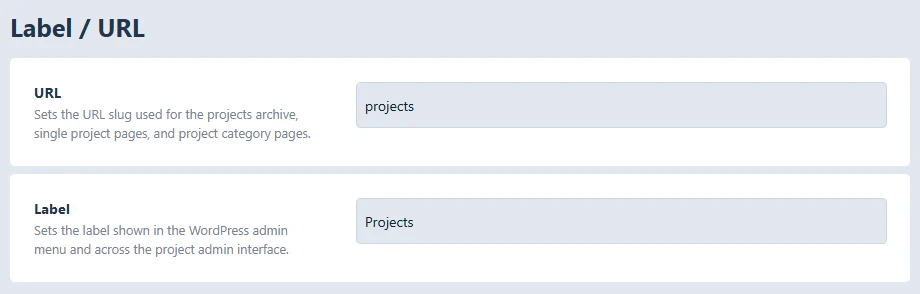
URL: Sets the public URL slug for projects.
Example: if the URL is set to ‘projects’, the main archive is /projects/
This slug is also used for single project pages and project category pages.
Example: changing it to ‘work’ would make project URL’s use /work/
Label: Sets the name used in the WordPress admin area.
Example: changing ‘Projects’ to ‘Portfolio’ changes the admin menu/interface label, but it does not change existing project data.
Main Landing & Category Page Options
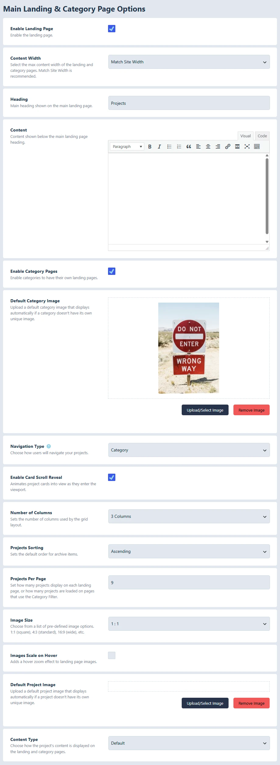
Enable Landing Page: Turns the main projects archive page on or off. When enabled, visitors can view the main project listing page. When disabled, the project archive route returns a 404 page.
Content Width: Controls the maximum width of the landing and category page content. Options include Match Site Width, Wide, Full Width, and Custom Width.
Custom Width: Only applies when Content Width is set to Custom Width. Enter the width in pixels, such as 1200 or 1440.
Heading: Sets the main heading shown on the main landing page. Example: Projects, Our Work, or Portfolio.
Content: Adds intro content below the landing page heading. This can be used for a short description, overview, or instructions before the project cards appear.
Enable Category Pages: Allows project categories to have their own public pages. When disabled, category archive pages return a 404. Category navigation modes that depend on category pages are also disabled.
Default Category Image: Used when a project category does not have its own image. This is most useful when categories are displayed as cards.
Navigation Type: This controls how visitors move through project categories.
Options:
- Disable: No category navigation is shown. The landing page simply displays projects.
- Category: Shows parent categories as cards instead of showing projects right away. Visitors click a category card to view its subcategories or the projects inside that category.
- Category Menu: Shows a navigation menu with category names. Visitors click a category name to go to that category page. The menu can also include All and Featured items.
- Filter Menu: Shows a category menu that filters projects on the same page. Visitors can click categories without leaving the current page. This mode also uses a Load More button when there are more projects than the visible limit.
Options for Category and Filter Menu
- Menu All Icon: Adds an icon to the All menu item when using Category Menu or Filter Menu.
- Menu Featured Icon: Adds an icon to the Featured menu item when using Category Menu or Filter Menu.
Options for Disable and Filter Menu
- Content Layout Style: Controls how project cards are arranged. Options are Justified, Grid, and Masonry.
Enable Card Scroll Reveal: Adds an animation where grid cards reveal as they enter the viewport. This applies to the grid layout.
Number of Columns: Sets how many columns the grid layout uses. Options are 2, 3, 4, or 5 columns.
Projects Sorting: Sets the default order for projects by date. Ascending shows older projects first. Descending shows newer projects first.
Projects Per Page: Sets how many projects show per page. With normal listings, this controls pagination. With Filter Menu, it controls how many projects are shown at first and how many are added when Load More is clicked.
Image Size: Sets the image ratio used for project and category cards. Options include square 1:1, standard 4:3, portrait 3:4, wide 16:9, and vertical 9:16.
Images Scale on Hover: Adds a zoom effect when visitors hover over project card images.
Default Project Image: Used when a project does not have its own main image.
Content Type: Content Type controls how the title/content area appears on project cards.
Options
- Default: Shows the card content in the standard card style.
- Moving Caption: Shows a caption that appears and moves with the hover interaction on larger screens.
- Reveal Caption: Keeps the caption hidden until the visitor hovers or focuses on the card.
- Overlay Caption: Displays the caption as a full overlay over the image during hover or focus.
On smaller screens, the card content is kept visible and usable so mobile visitors can still read and tap the project information.
Details Page Options
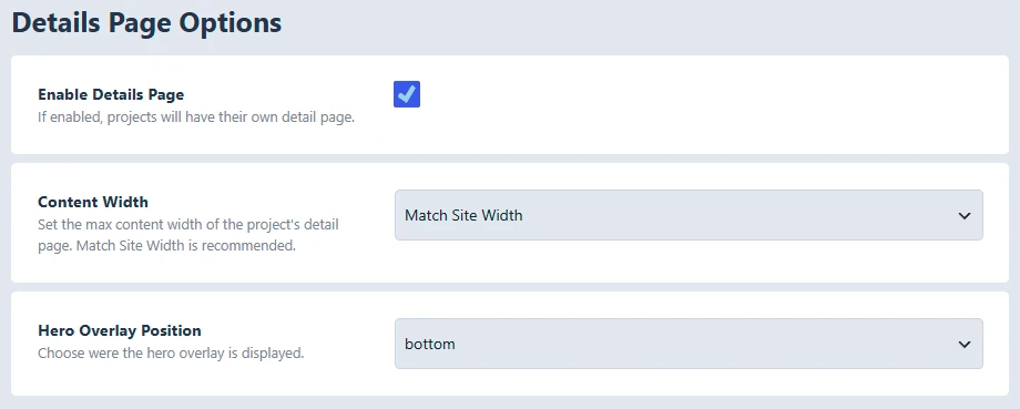
Enable Details Page: Allows each project to have its own individual detail page. When disabled, single project pages return a 404 and project cards do not link to detail pages.
Content Width: Controls the max width of the single project detail page.
Options:
- Match Site Width
- Wide
- Full Width
- Custom Width: Sets the detail page width in pixels when Custom Width is selected. The default is 900.
Hero Overlay Position: Controls whether the project hero title overlay appears at the top or bottom of the hero image.
Custom CSS
CSS Editor: Adds custom CSS for the Kraken Projects front end. Use this for small display adjustments that are specific to project pages, cards, navigation, or detail pages.